How Santa Barbara's Architecture Tells You Exactly How a Home Should Feel Inside
The first thing I do when I walk into a Santa Barbara house isn't to picture furniture. I read the walls. Working as an interior designer in Santa Barbara, I've learned the building has already made about half the decisions for you, and the smart move is to listen rather than argue. The arches, the plaster, the deep window wells, the way a room leans toward a courtyard. All of it is telling you how the home wants to feel. Most people don't realize how much of that vocabulary is the law.
Why Santa Barbara Looks the Way It Does
On June 29, 1925, an earthquake leveled a good part of downtown Santa Barbara. What got rebuilt afterward wasn't accidental. The city used the rebuild to commit, hard, to Spanish Colonial Revival and Mediterranean architecture, and those rules have been protected and enforced ever since by design review boards that still say no to things they don't like. So when you buy a house here, you're often buying a set of constraints that are nearly a century deep. White stucco. Red clay tile roofs. Wrought iron. Arched openings that frame a view the way a doorway in Andalusia would. I spent years in Europe before I ever called myself a designer, walking old towns in Spain and Italy and the south of France, sketching arches and courtyards and the way thick walls hold cool air. I didn't know it then, but I was studying for a job I'd be doing in Montecito forty years later. The Santa Barbara interior design style descends straight from those places, filtered through California light. Nobody invented it as a trend. That history changes what good design even means here. There are no blank boxes. Every one of these buildings speaks with an accent, and your job is answering it.
The Architecture Is Giving You Instructions
Let me walk you through the signals I actually look for.
Arched Doorways Want Soft, Not Sharp
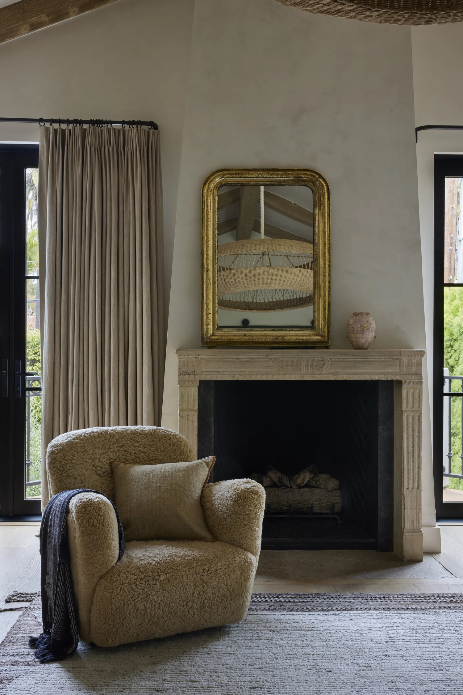
An arch is a curve. When you fill a room with hard right angles underneath a row of arched openings, the eye notices the tension even if the client can't name it. I respond to arches with rounded forms. A curved plaster fireplace. A round pedestal table in white oak. A vintage settee with a serpentine back, something I'd hunt down rather than order new. But I don't make everything a circle either. That goes saccharine fast. You want maybe two or three curved gestures in a room and then the discipline to stop, because a space that agrees with itself too completely starts to feel like a hotel lobby.
Plaster Walls Change How Color Behaves
Real plaster, and especially limewash, isn't flat the way drywall paint is. It moves. At 4pm the light comes off a west-facing plaster wall in Summerland and goes gold and a little chalky, and the wall seems to hold the warmth for an hour after the sun's gone. A color that looked perfectly neutral on a chip can read pink, or green, or dead, depending on what the plaster does to it. So I test. Always, on the actual wall, in the actual room, over a full day. I've watched a beautiful warm white turn the color of a bruise by evening because nobody checked it against the north light. The trade-off with limewash is real, though, and I'll be honest about it. It's harder to touch up than paint, it costs more, and if you've got young kids and sticky hands you'll be living with some marks. Some clients love that patina. Some hate it. I ask before I spec it.
Thick Walls and Deep-Set Windows Are a Gift
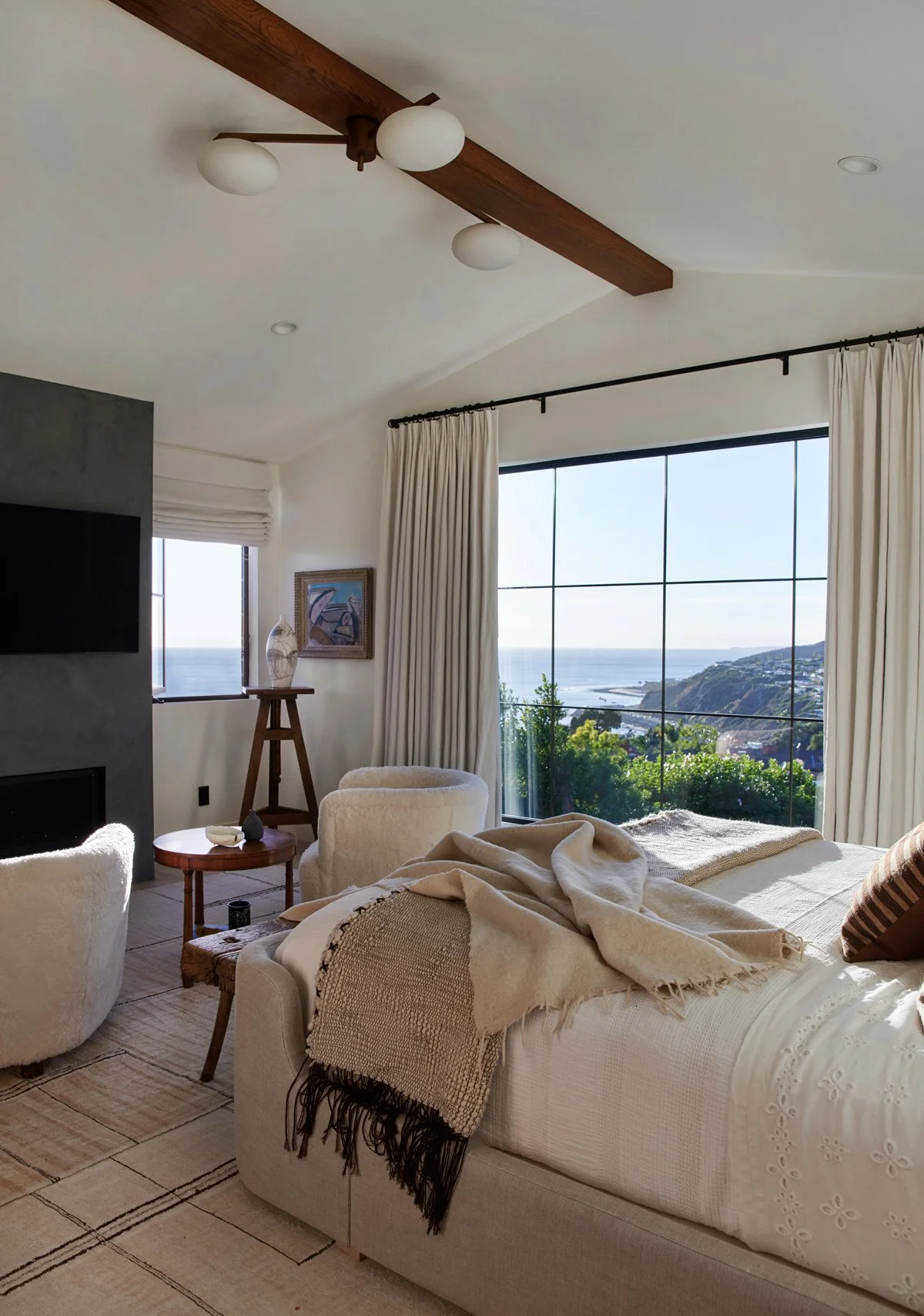
Old construction here gives you walls of eighteen inches, sometimes more. All that depth around a window is a gift. A shelf. A seat. A place for light to pool at the end of the day. I'd never cover it with a flush drapery panel that flattens the whole thing, so a cushion goes right in the reveal, or a simple linen Roman shade that lets the thickness show. Those heavy walls also hold a room cool deep into August, honest work the house does for free.
Terracotta and the Warm Palette It Demands
You'll find a lot of terracotta floors in houses here. Saltillo tile, hand-laid, sealed to a low sheen, with that orange-clay warmth that's almost impossible to fake. It anchors a room at a specific temperature, and you have to design up from it. What that means in practice: cool grays clash with terracotta. Stark whites float over it and look cheap. I build with warm earth tones, the palette I keep returning to in my own work. Linen the color of oatmeal. Aged brass with a cold, real weight to it when you pull a drawer. Oak. Rattan. Stone that's got some sand in its color. This is the warm modern aesthetic I've spent my whole career on, and Santa Barbara is almost the perfect place for it, because the architecture wants warmth and restraint at the same time. I lost my own family home and everything in it in the 2018 Woolsey Fire. Every vintage piece I'd collected over decades, gone in a night. Rebuilding that collection from zero taught me something I now tell clients constantly, which is that the warmth in a room almost never comes from the new stuff. It comes from the one old thing with a history, the 1960s Danish credenza or the worn leather chair, set against quiet new bones. If you want to see where I find those pieces, I wrote about the antique and vintage shops worth hunting down up and down the coast.
The Courtyard Relationship Is the Whole Game
Here's what nobody tells you. Houses like these aren't really organized around rooms. They're organized around the spaces connecting rooms, the courtyard, the loggia, the covered exterior that's neither fully in nor fully out. A good interior decorator in Santa Barbara designs the inside and the courtyard as one continuous idea, the same flooring carried through a French door so the threshold disappears, the same warm plaster on the interior wall and the garden wall it faces, an interior sightline that lands, on purpose, on a fountain or an olive tree or a single climbing rose. One idea. No seam. When you get all of it right the house feels twice its actual size, and the gold afternoon light moves through it like water. I've written more on what the region understands about that in-between space, in what Santa Barbara gets right about living between indoors and out. And sometimes you can't get it right. An older floor plan with the kitchen walled off from the courtyard, low ceilings, a window in the wrong place. I'll tell a client honestly when the architecture is working against the life they want, because sometimes the answer is a real renovation rather than a sofa, and pretending otherwise just wastes their money.
Working With the House, Not Over It
The mistake I see most often in 805 interior design, from people who mean well, is importing a look that has nothing to do with the building. A cold, gray, hard-edged interior dropped straight into a 1928 Spanish Revival. It can be expensive and still feel wrong, because the bones and the contents are speaking two different languages. My job is closer to translation than decoration. I read what the architecture is already saying, then I answer it in a way that's livable for the people actually living there, which usually means rounding off the purism a little so real life fits inside it. Restraint, natural materials, a few rare old things, warm light. That's the whole recipe, and it works because the house was built to receive it. Weighing what a project like that requires before you commit? I've laid out what it actually costs to hire a full-service interior designer, so the numbers stop being a mystery. Every house here has an opinion. I work out of a studio on Montana Avenue in Santa Monica, and I spend more weeks than not on the 101 corridor in Montecito, Santa Barbara, and Summerland. If you've got a house here that you suspect is trying to tell you something, I'd love to hear about it. Come book a consultation with Janette Mallory Interiors, and we'll start by reading the walls together.